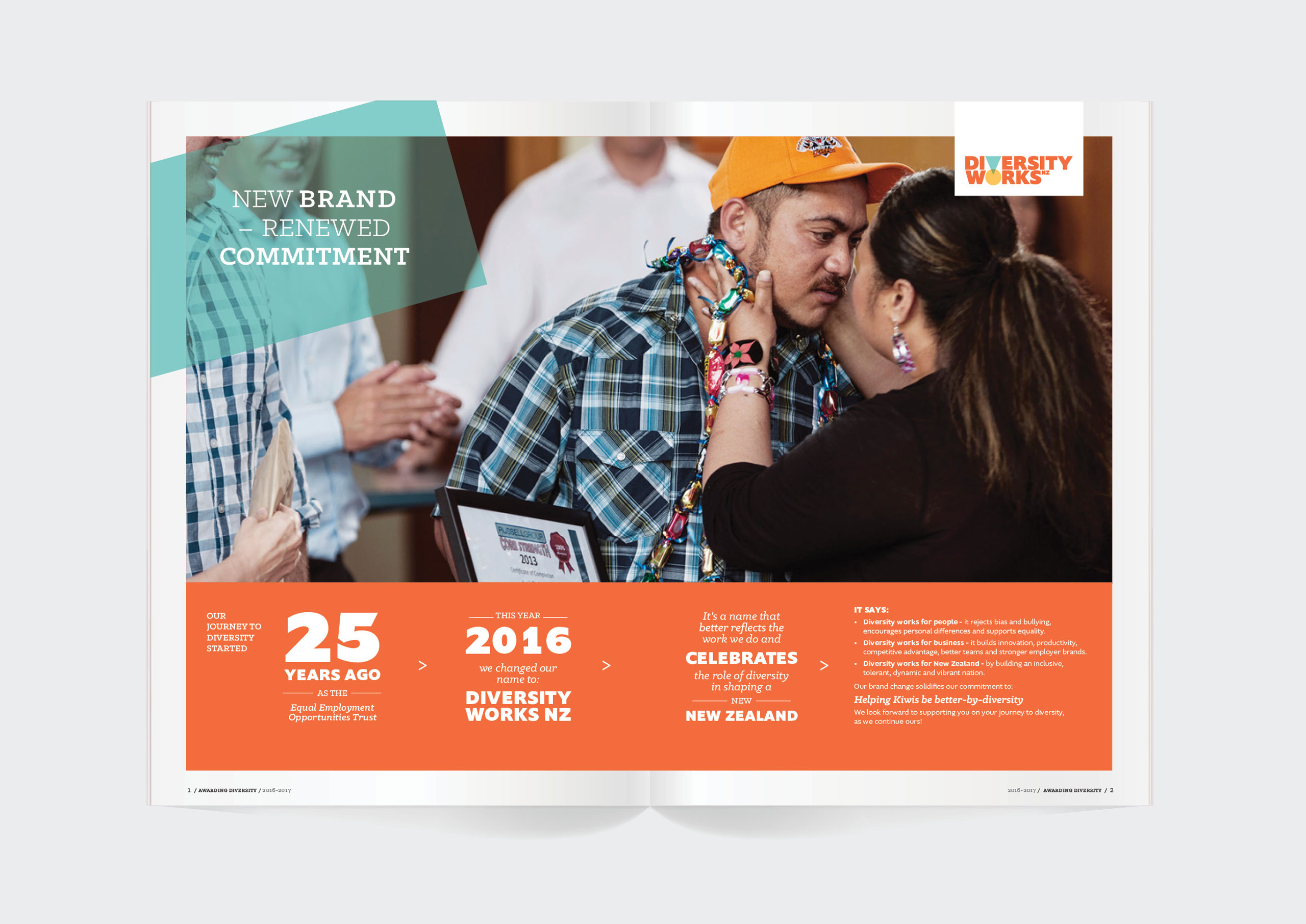
The EEO (Equal Employment Opportunities) Trust had a dated image and a name which no longer served their reason-for-being. We were charged with helping the organisation re-invent (from the inside out) to focus on, and celebrate its fervent belief that Diversity Works to shape better business, a more open, tolerant and creative working culture and a stronger, more vibrant nation.
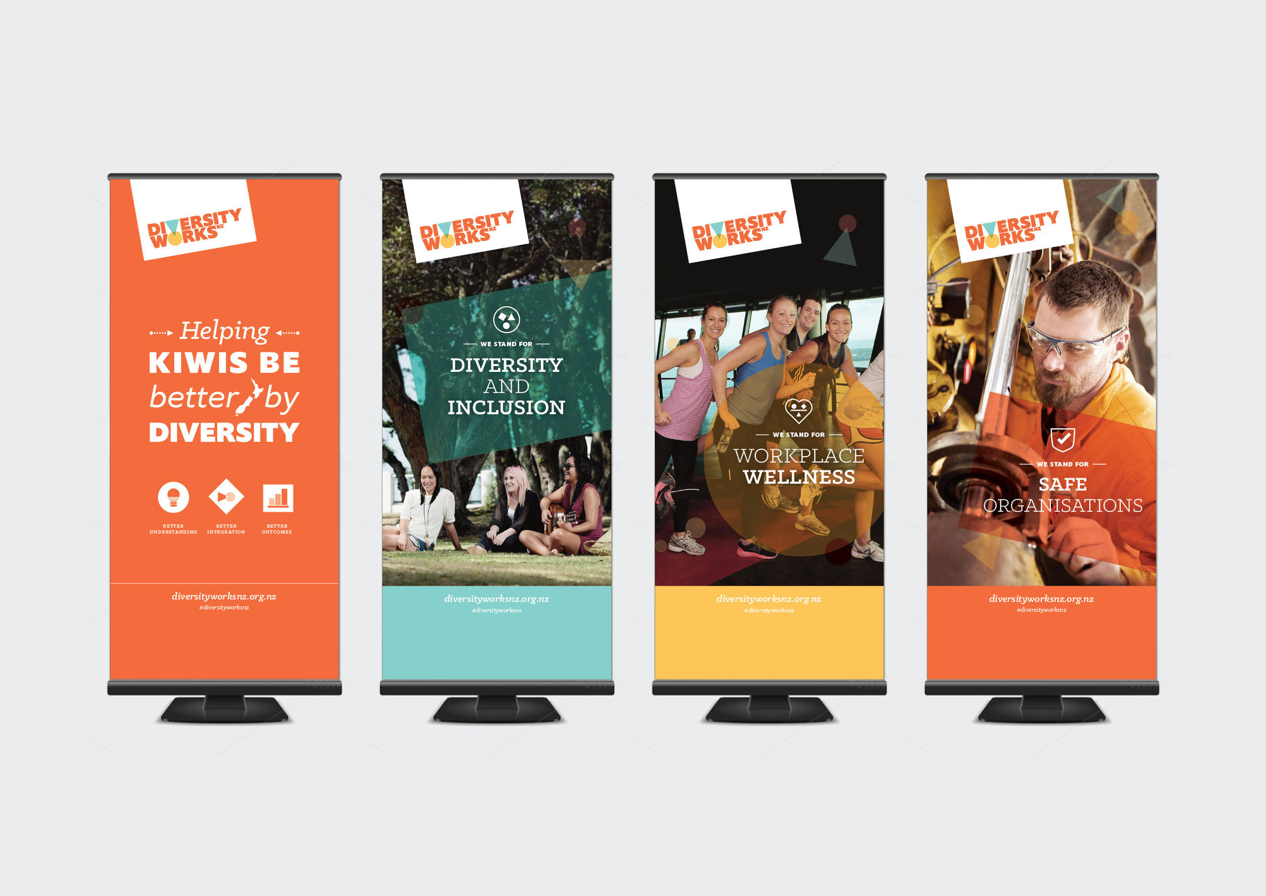
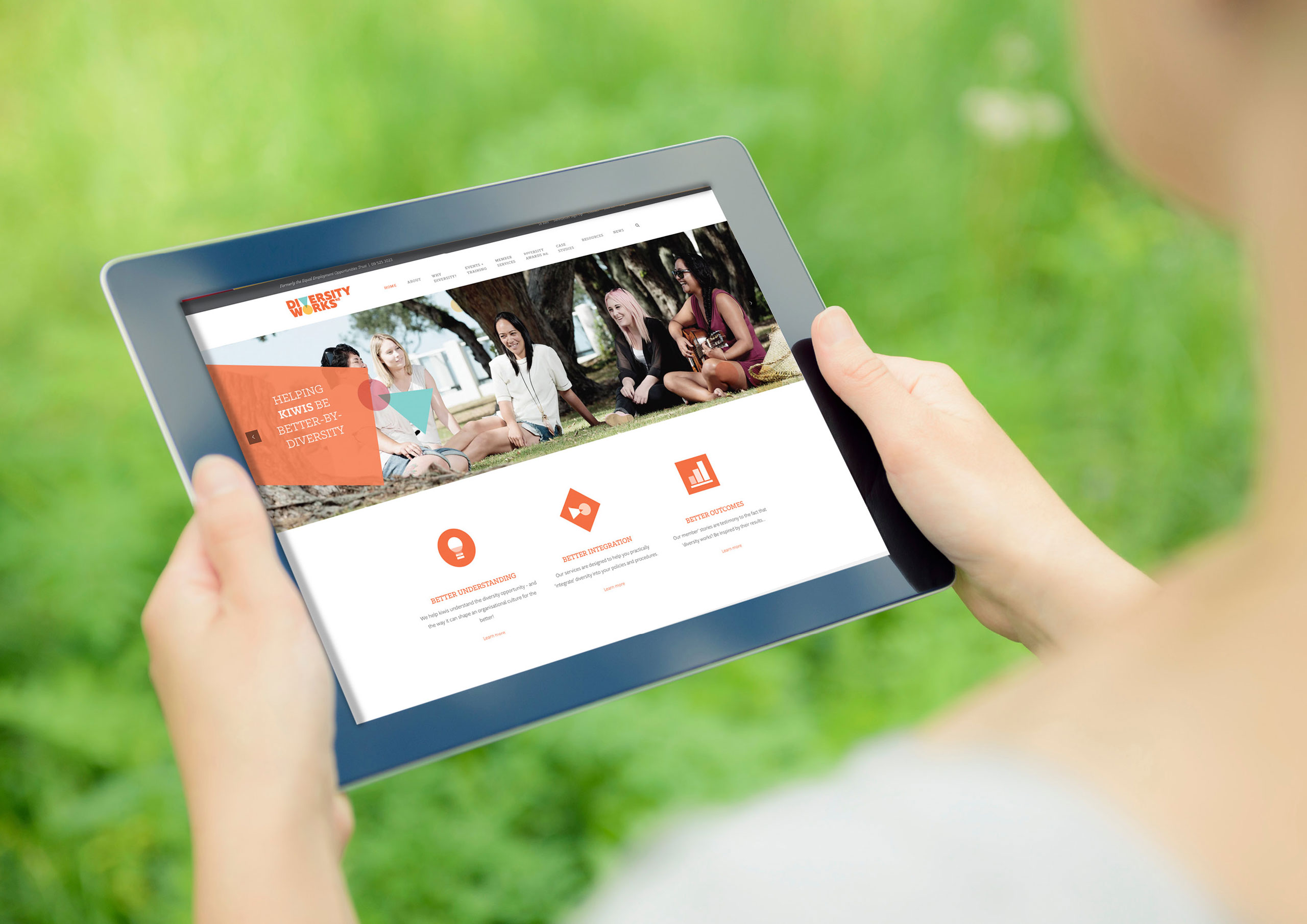
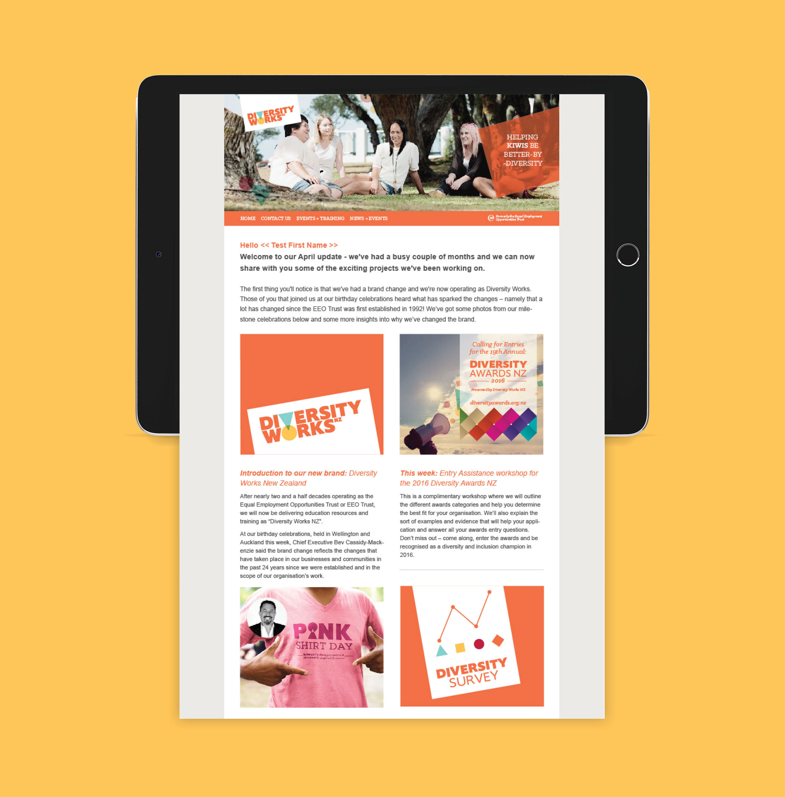
Stakeholder workshopping surfaced the driving purpose of: Helping Kiwis be better by Diversity. The brand framework underpinned this by unpacking three diversity services and customer benefits delivered by Diversity Works. These were: a better understanding (education), better integration (policy shaping advice and deployment) and better outcomes (a thriving workplace – the Diversity Awards case studies are testimony of client success and outcomes). This formed the brand architecture and narrative unperpinned each offering/pillar using a vibrant, human and uplifting tone.
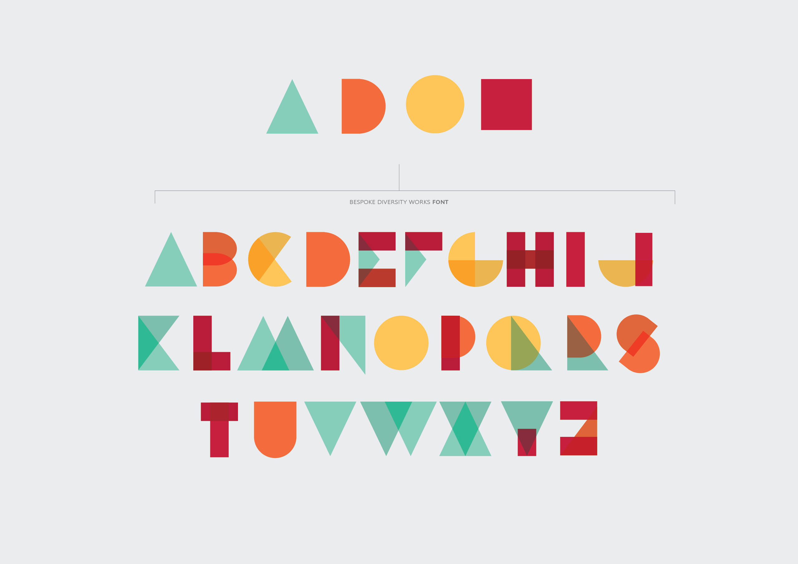
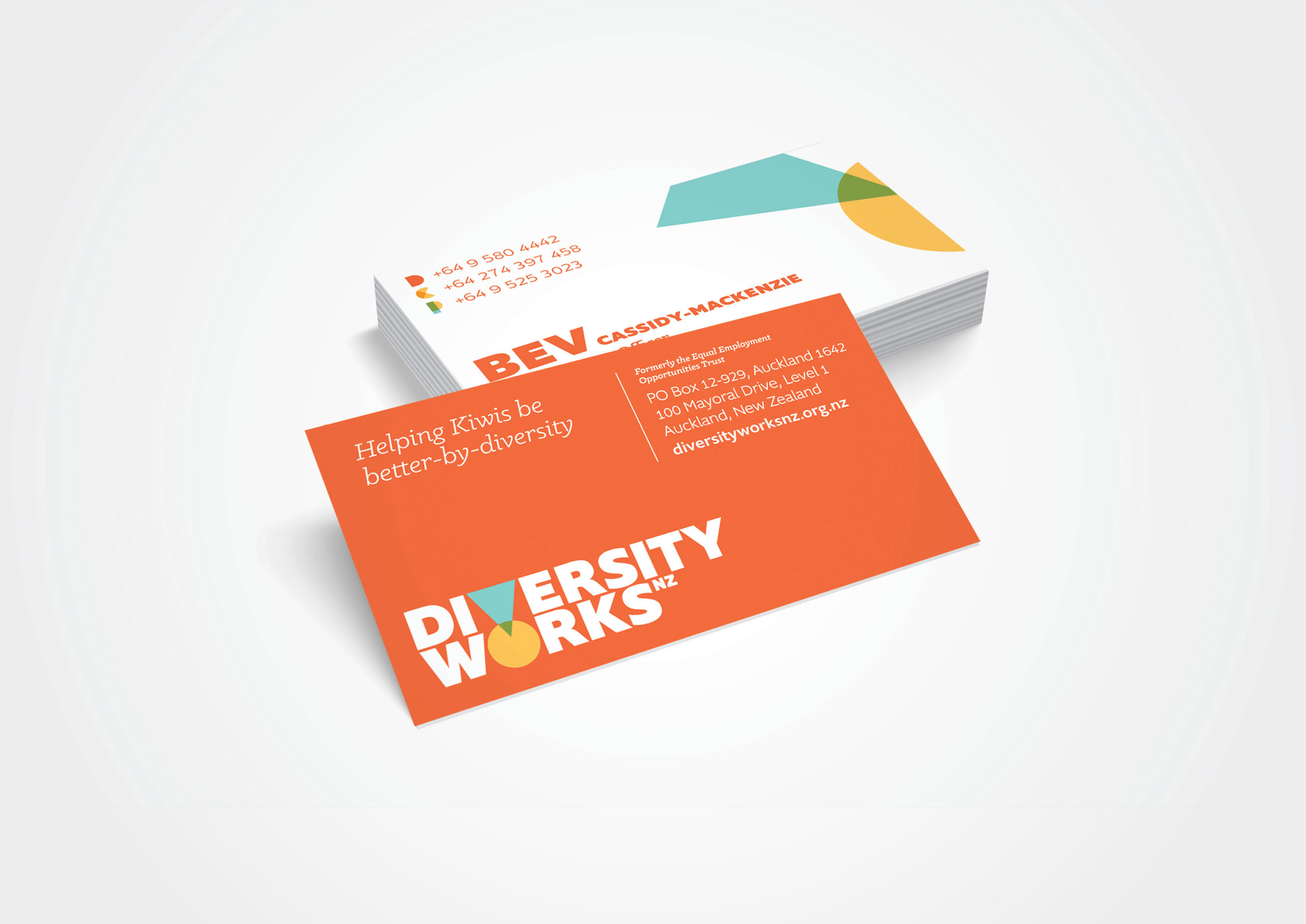
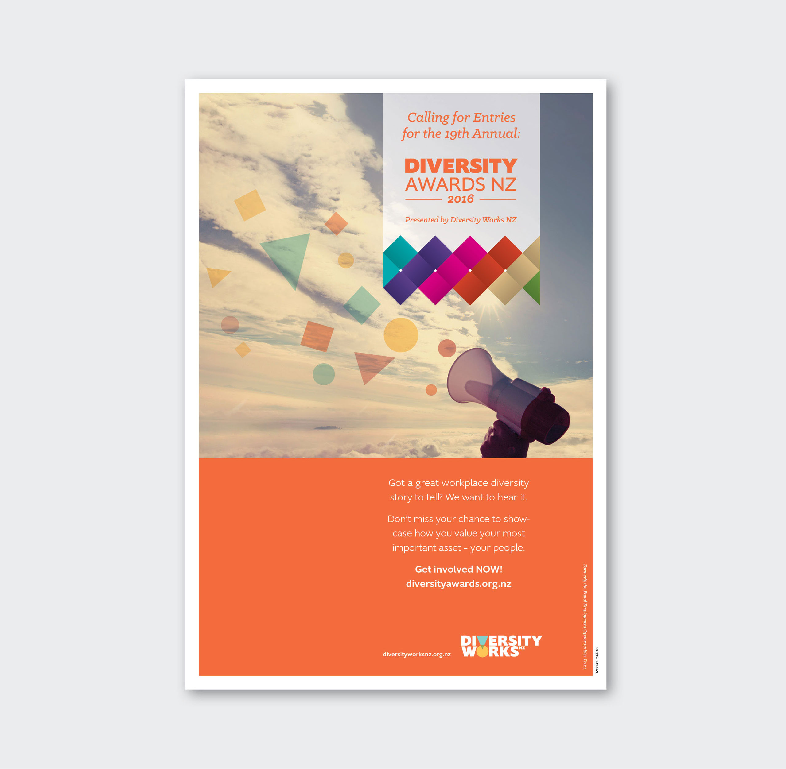
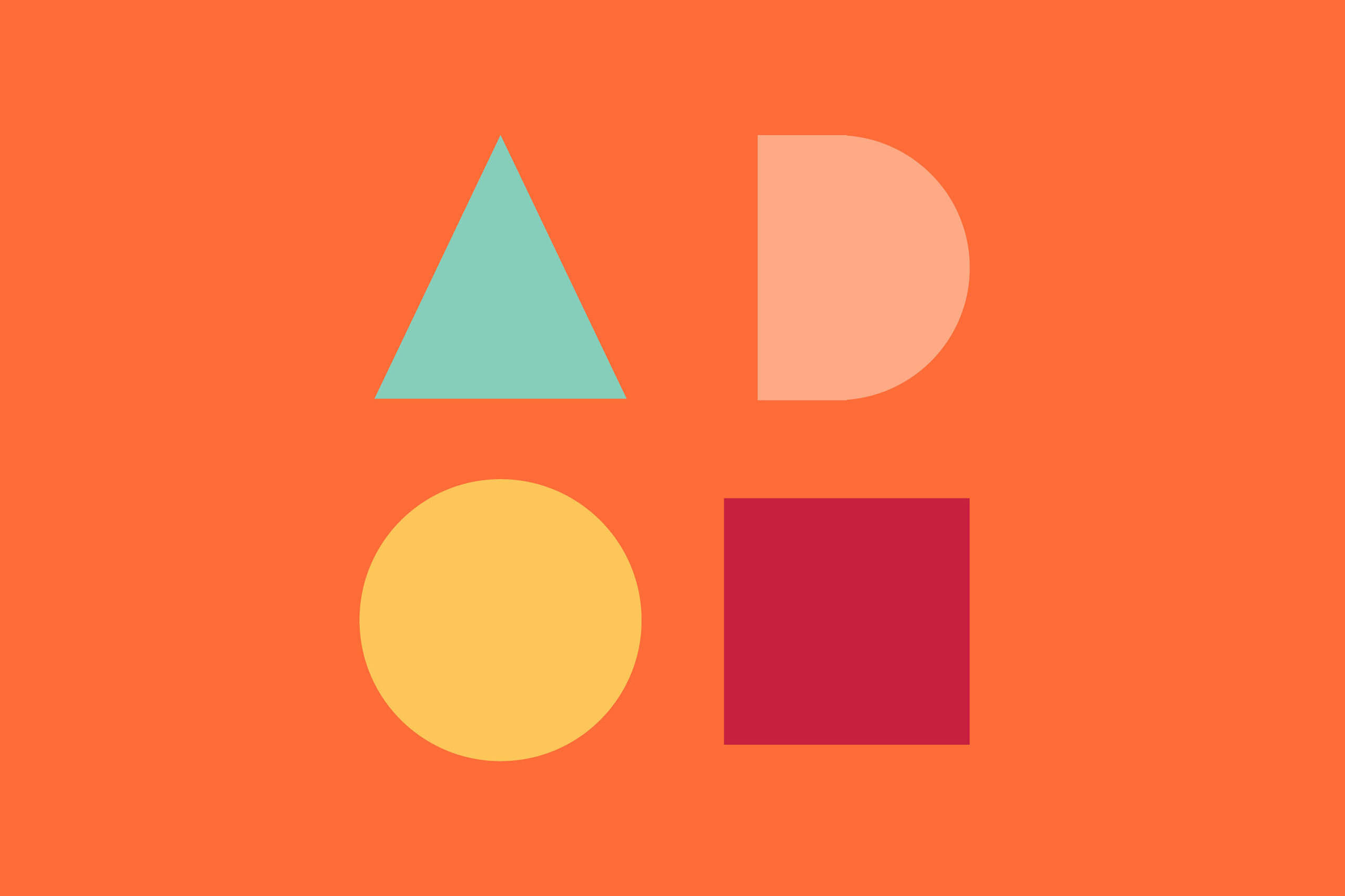
Strategy, positioning concept, naming, story and identity system helped reposition the organisation as the inspirational, vibrant and approachable advocacy organisation that it is. Story was brought to life through a visual language system of intersecting shaped coming together to form an alphabet and iconography – a metaphor for diversity itself! The primary orange of the EEO Trust was retained and built upon with a strong and vibrant palette.
Diversity Works received outstanding feedback to this rebrand and has experienced heightened membership, profile and traction with the business community as a result.
Brand Strategist: Diana Parry
Designer: Georgie Sigglekow